I’ve been asked a lot about tips for aspiring animators, so here are some ! Enjoy, I hope it will help some of you.
Oh, and for the ones wondering who I am, I’m a french 2D animator. I studied animation at Gobelins like 10 years ago and ever since I’ve been mostly working as a 2D animator for feature films, commercials, shorts and shows.
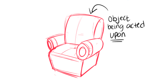
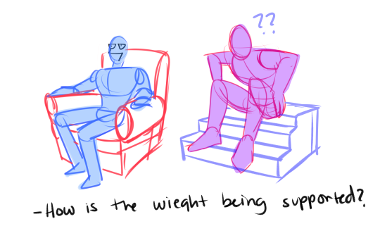
OKey dokey, uncle Aes has some tips that’ll make your lives a little more easier. This is how to make a picture more believable when having a character interact with an item that is larger than their persons. First tip! -Always draw the object that is being acted upon, FIRST.
Let’s take this chair for example, drawing a character sitting is not an easy task, I know. But with a little know how and can-do it can be pretty fun and satisfying. Drawing the object that is being acted upon first not only lends a little more realism, but it also really helps when you are drawing in perspective, case and point
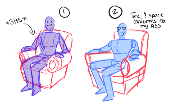
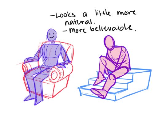
Here is the difference between 1)drawing the chair first, THEN drawing the figure, versus 2)Drawing the figure first, then drawing everything AROUND that figure. #2 does not make a lot of sense, it’s all wonky and the proportions are all wrong, this is because the chair is conformin to the figure’s weight.
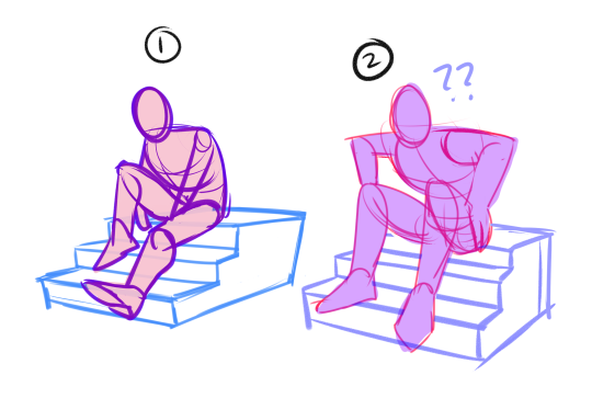
Example 2, stairs. Figure 1 will always look more believable than figure 2. The figure drawing in example 1, is under the forced perspective that the stairs lend. Example 2 makes for a confusing picture to look at. because we don’t know where the feet fall naturally, and the stairs are uneven and UGLY
With both examples where the character is drawn first, the weight of the character is manipulating the environment around it, instead of the other way around. Perspective is really hard to understand, but it is really important to practice it EVEN if it looks funny. In these examples right above, they do not give a very realistic/believable reading. It’s always gonna be a guessing game of where to put an object, and if you’re gonna have a guessing game it might as well be the CHARACTER you’re guessing about and NOT the environment.
All in all, to those strugglin with drawing characters in an environment, always ALWAYS draw the object that is being acted upon FIRST. I’m not gonna say that my drawings are absolutely accurate, they still look wonky time to time, but it helps to be mindful of these things! Don’t be afraid to try tho, always use a reference and soon enough you’ll get the hang of it too :^y
That means free access to Photoshop CS2 – and that already has most of what you could ask for, really.
All you have to do is create a FREE ADOBE ID.
I am not sure about commercial use, but MAN. FUCKIN’ SWEET DUDE
Reblogging for the greater good.
I’m unlikely to pick it up as I honestly never use PS anymore, but here everyone who follows me. Free stuff.
oh wow this is perfect i was just lamenting that i’d have to buy creative suite for my new laptop WELP
Signal boost for any of my followers who need art programs!
The cs2 programs date back only a few years, and still have much of the functionality of today’s more modern ones. The differences between most of the versions are little more than slight modifications or additions of minor features, and UI changes. Go for it guys!!
important things for new or young digital artists to remember:
don’t shade colors with black
don’t overuse the airbrush tool, especially when it comes to shading
layers have different settings, explore them!
if your lines are wiggly when you draw, check your brush stability settings
if you find your lineart is looking too stiff/not like your sketch, try cleaning up the sketch instead of lining it. it helps keep fluidity and the feel of your original drawing
crop your pictures, don’t leave a ton of empty space unless you add some kind of background
make sure your canvas is set to at least 300dpi
draw on a large canvas ( i draw on a 3000x3000px canvas) it will be easier to line your work and everything will look much smoother even if you shrink it down
.jpeg files save space, but this file type may compress your art and sacrifice quality. when I post art I always use .png
Krita is a painting program that has been around for a while, and in the last few years, underwent major changes and improvements. Because of these improvements, many artists are using it not just because it is free, but because it offers amazing features. These are by no means all of the great things Krita has to offer, but simply some of my favorite features of the program.
1. The Brush Engines.
Yes, engines. As in plural. There are many. And they all do different things. There is no way you could possibly capture all of its possibilities with one screen shot, but here are just some of the possibilities. Along side standard round, square, and shape, and textured brushes, there are brushes that smear, blend, and create interesting abstract strokes. There are brushes for filters, and one of my favorites, the Experiment Brush, which is basically a pre-filled lasso tool.
Brushes also support weighted smoothing, or brush stabilizers.
This is incredibly useful for line art. And while I do not usually use this feature, it is something that I feel many programs are lacking, such as Photoshop.
But its brushes aren’t the only thing about Krita with variety.
2. Color Selector Customization.
Whether you prefer something basic, or something more complicated, Krita will likely have what youre looking for. You are not likely to find yourself missing your other program’s color wheels. There are even more options than this, and other color selectors.
Gotta love that customization.
Krita also has some great naviation tools.
3. On the fly rotation, zoom, and brush sizing.
With krita, zooming, rotating, and brush size scaling are all smooth, and dynamic with the use of hot keys. These are features I miss when in other programs. To zoom, Ctrl+Middle mouse button, hover over the screen to zoom in and out. The same with shift rotates (press the ‘5’ key to reset rotation). Holding down shift and draging your brush on the canvas dynamically changes its size, allowing you to see the change, and get the exact size you want without brackets. Brackets also work, if that’s what you are used to. Krita also has highly customizable hot keys.
4. The Pop Up Pallet
The pop up pallet is a set of your 10 favorite brushes (which you can edit), and a built in color wheel that appears when you right click on the canvas. It is incredibly useful for switching between those few brushes that you use in almost every picture.
5. Real time, seamless tiles creation.
Pressing the W key in Krita will infinitely tile your canvas, and allow you to work real time on simple to complex tiled images. You can zoom in and out to see how your tiles work form a distance, and paint freely to create seamless artwork easily, without having to check using filters and manually tiling. Very usefull for patterns, backgrounds, and games.
6. The Symmetry Tool
This one goes without saying, Krita supports both horizontal and vertical symmetry, along with a brush that is capable of radial symmtry with as many directions as you like.
Go nuts, kid.
There are many more reasons why this program is awesome. And it is only going to get more awesome. And the coolest thing about it, is that it is 100% free. So go check it out! There’s nothing to lose. Krita isn’t for everyone, it can be hard to get the hang of, and it is not meant for photo editing, it is a program completely focused on digital painting from start to finish.
Give it a go and see if Krita is the program for you.
Degrees of Emotion It annoys me to no end when people have a bad day and talk about how “depressed“ they are. So, I made some emotional scales. These show the extremes of emotions and the most minimal state of the emotion.